by admin | May 23, 2014 | |
Financial Times World leading Business News The Challenge Tony Davis was approached to explore the possibility of creating designs using the Financial Times (FT) brand. The brand already had logo-stamped products for sale on demand. The company wanted to create the possibility of designs which has the same resonance as the Penguin Designs project. The main challenges were in identifying a ‘more-than-just-logo’ approach which had life beyond one-off, short-run, commissioned products. The FT is owned by Pearson. About Financial Times: For more about FT look here. Project Overview & Solutions Wealth consists not in having great possessions, but in having few wants - Epictetus There were a number of meetings about design approaches with John Ridding and Caroline Halliwell (Director of Brand and B2B Marketing). Colour, Logo, typography were all unique potentials for designed ranges. It was less clear whether the actual published output (stories, headlines etc – which tended to be quite serious) could be adapted even though this was a rich source of material. The main focus for prototyping was in typography, quotes on subject matter (economics, money etc) and layout designs for simple, stylish objects. Whilst the project was only consultative it was nonetheless an exercise in exploring a challenging subject area via one of the world’s global brands whilst still maintaining a fitness-for-purpose ethos. Website: N/A Distribution: None Availability: None of the designs were adopted or produced. Contact us if you have any comments about the work. Design Ideas which stayed as protoypes If you are truly innovating, you don't have a prototype you can refer to - Jonathan Ive Other Projects All life is an experiment. The...

by admin | May 13, 2014 | |
Fuse A lot of words in English confuse the idea of life and electricity, like the word livewire - Laurie Anderson Limited Edition available to buy online at Visible Object UK The Challenge Having been slightly obsessed with the prosaic, workaday, functional fuse since first watching his Dad change one Tony wanted to play with scale to create a light. He was also interested in the nature of the fuse’s importance in plugs, how we can’t run our homes without one, that we never have the right one to hand when one blows (and just what is going on when that happens?). About Fuse: Fuse was a lamp design part of a range of lighting designed by Tony Davis and launched at 100% Design in 2008. Tony worked with Jon Baker of Design360 on the technical elements of the Lamp. Project Overview & Solutions If a man loves the labour of his trade, apart from any question of success or fame, the gods have called him - Robert Louis Stevenson The design approach was to explore a scaling of the humble fuse which (thought they vary) only millimetres in diameter. Once this was decided everything else followed on. The end caps were spun aluminium with a local metal working company. The central area was created with perspex tubing. The opalescence came from a film later on the inside silk-screened with the surface details. The base featured small unobtrusive nodes to hold the design slightly proud of any surface. A small number of wall brackets were created to replicate the bracket found within a typical 13amp UK plug. The final design...

by admin | May 13, 2014 | |
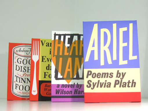
Faber and Faber Poetry meets Publisher meets Designer The Challenge To work with Faber and Faber Limited to explore the Faber & Faber archives, back catalogue and nature of its business as a publisher to create designs which could both exist as designs for retail but also complement the Faber brand and books taking it into new areas of business. It was clear from the outset working with Rights Director Jason Cooper that the published back catalogue, the designs, and relationship with authors or their estates created a complicated scenario for any design development. This presented the bulk of the challenge, working through the wealth of back catalogue and archives establishing where the rights resided for cover designs (illustrated or otherwise). In addition to in-house design and illustration Faber also had established relationships with outside design agencies like Pentagram whose Justus Oehler created designs for Poetry series paperbacks. About Faber: Faber and Faber, often abbreviated to Faber, is an independent publishing house in the UK. Its former editor was T. S. Eliot. Faber published William Golding’s Lord of the Flies, which had previously been rejected and ignored by many publishers. The company was named Publisher of the Year in 2006. Project Overview & Solutions If a man loves the labour of his trade, apart from any question of success or fame, the gods have called him - Robert Louis Stevenson Three main areas of potential were explored: Cover archive The Poetry Series Editiorial Archive Cover Archive Select covers were taken from ‘classic’ designs in the Cover archive for use in Print-on-demand. These were produced to order. The most popular covers were: Sylvia Plath’s...

by admin | May 13, 2014 | |
Penguin Books Classic Paperbacks and Iconic Brand The Challenge Tony Davis was inspired by the original classic banded Paperbacks (designed by Edward Young in 1935) from Penguin. He grew up seeing them everywhere and then they disappeared except to collectors. The Penguin Brand and familiar (if subtly altered logo) was still very much evident but book design had moved towards photography and illustration in the 50s and 60s. The original cream and orange banded paperbacks could only now be found in secondhand bookshops. The orange still remained a key part of the Penguin logo. So how to translate a design (from the 1930s onwards) which still had a cognoscenti following amongst typographers and designers but had largely disappeared from public consciousness? The original typography was created by Jan Tschichold. Unless you were 50 or over it is unlikely this style of books would mean anything to you. In fact, one of the first comments on starting the project was by a retailer who said ‘great. people over 50 will really love this…’. Tony Davis’s exciting vision was that the originals (in all their variety) could be ‘translated’ into lifestyle objects which were utilitarian and mass-market, affordable yet without sacrificing quality (like Allen Lane’s original intention for the Paperbacks). In addition, there was the potential to play with language and the relationships of Author and Title with an object. Suggestions anyone for Raymond Chandler’s The Big Sleep…? About Penguin: For more about Penguin look here. Project Overview & Solutions Books do furnish a room - Anthony Powell Books do indeed furnish a Room. What if books could be the cultural source for objects...

by admin | May 13, 2014 | |
TimeOut Classic magazine defining a generation... The Challenge TimeOut is an iconic listings magazine launched in 1968 by Tony Elliott and Bob Harris (who went on to host BBC’s Old Grey Whistle Test). It’s easy to say that pretty much anyone who grew up, lived in or has visited London since then will have seen or know the TimeOut brand. One of the most iconic aspects of TimeOut is the logo – the neon sign is still evident in Tottenham Court Road, London where the group is headquartered. Another is the use of good design and editorial for its covers. Leading designers and photographers like Pearce Marchbank and Rankin have designed and photographed for it. It has also featured everyone of note: Actors, Musicians, Authors, Artists. In short, it is part of the culture. Creating designs which crossed over forty years of brand evolution, covers design and typography was never going to be easy. During the development phase 50% of the group was sold to Peter Dubens and Oakley Capital. See the results of the work below. About TimeOut: For more about TimeOut look here. Project Overview & Solutions In a magazine, one can get - from cover to cover - 15 to 20 different ideas about life and how to live it - Maya Angelou There were three main design approaches identified in the TimeOut project. Each presented different opportunities and challenges: Cover Archive – This is the richest source of designs which crosses five decades and defines the look and feel of all of those periods. It also presented a problem in rights as some photographers, illustrators and designers weren’t known. Others...


